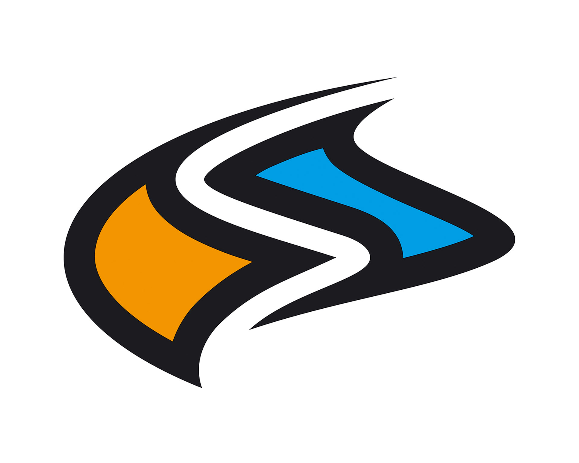
Let’s pretend we have the best-hidden secret in the kite industry! Imagine our beloved logo-icon, the “FS Button” has an important meaning?!
Yes, we are talking about an evolution that started exactly 20 years ago. Meet the creator Rolf Rinklin: a creative mind, a paraglider-pilot and a truly unique character. When we first heard the story, it blew our minds. 🤯
Chris: Hello Rolf, our colleagues at skywalk paragliders praise you as the creative mind behind their brand identity. What was your thought process during the first drafts?
Rolf: The skywalk image was intended to stand out from the established brands. We wanted to be new, modern and of course recognizable at first sight. Initially, the design arcs were aligned in the direction of flight. In 2005, we changed the arrangement against the direction of flight to differentiate ourselves even more. This decision polarized people, as many pilots felt the glider was flying upside down. Since that time, the design has gone through several stages of evolution. The new design language continues the tradition of unconventional arches and ties the product range from the gliders to harnesses together.
Chris: I simply love the process of creation. Many do not know that you influenced FLYSURFER Kiteboarding in a very similar way. You pretty much did everything by yourself, kite graphics, adverts, logo, font etc. Can you tell us, how you came up with our “FS-Button” because the colour choice became FLYSURFER’s brand identity back in the day?


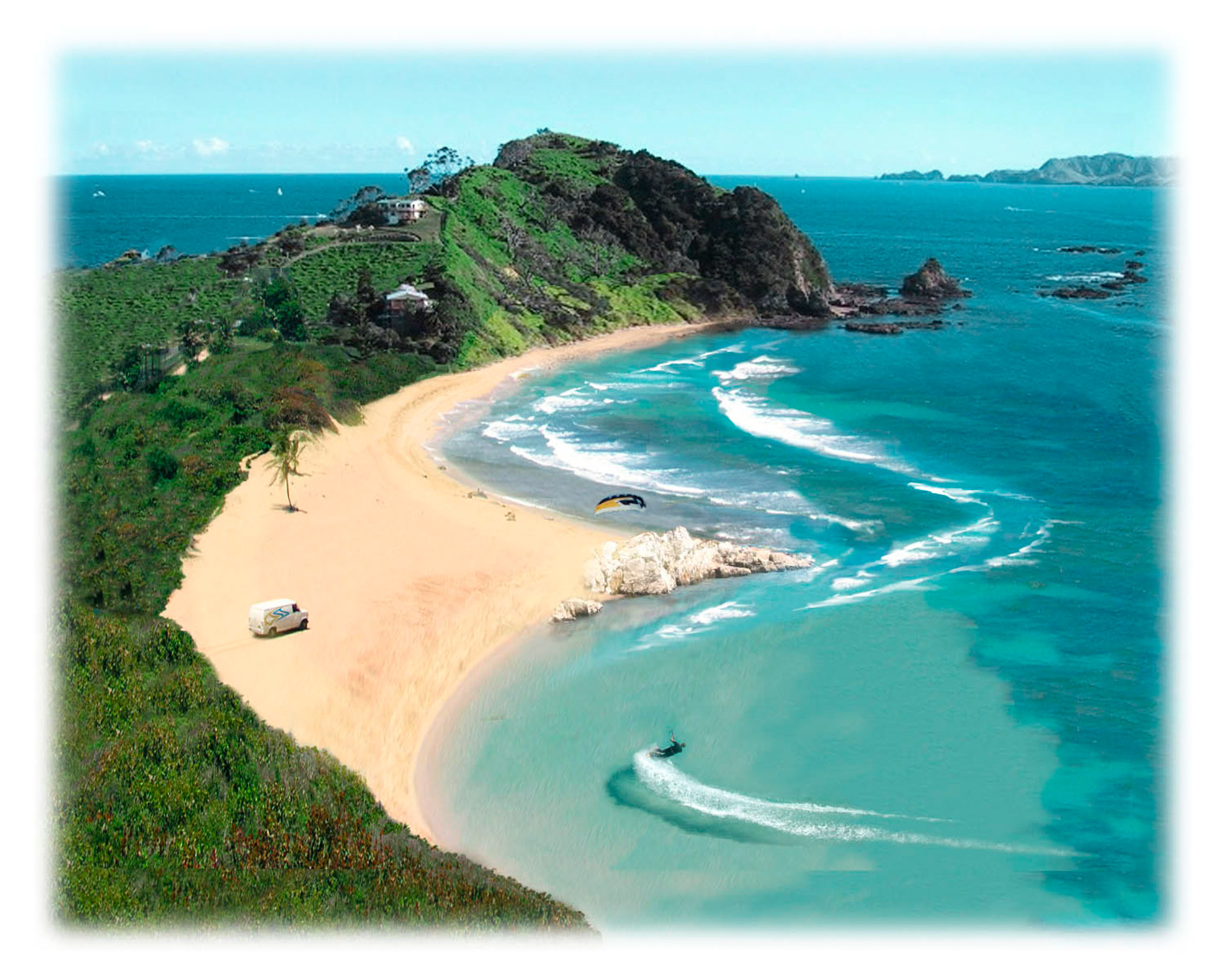
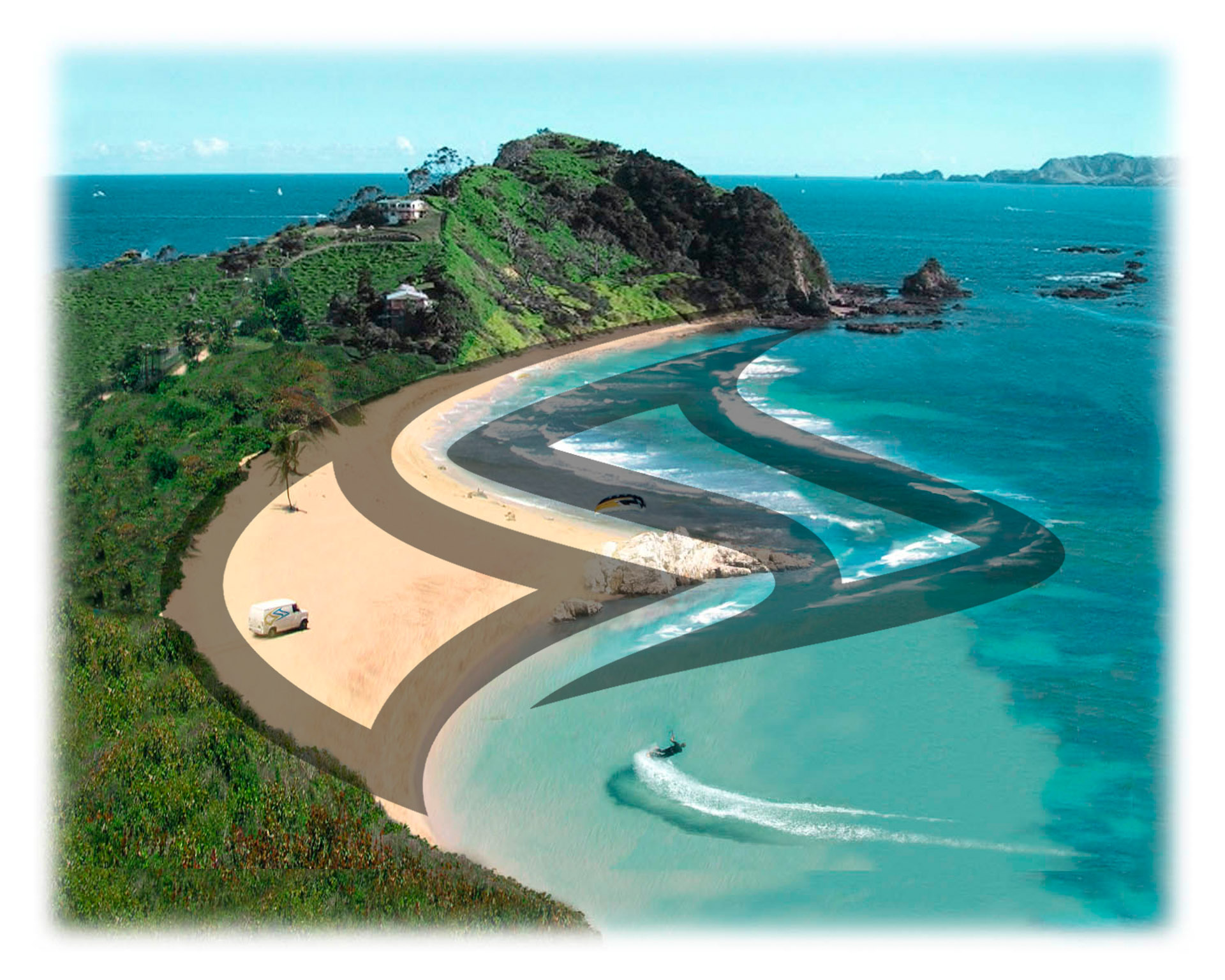
Rolf: Well, that’s a funny story! I wanted to achieve certain flexibility in how the new brand identity can be used. The brand FLYSURFER is graphically depicted by two different elements: The created logotype “FLYSURFER“ and the “FS-Button”. Both elements can stand completely alone depending on the implementation. The vertically positioned wave came in a circle and I came up with the idea of letters flowing into one another and continued to work on it. Then the idea of a sandy beach and the sea came up relatively quickly. The standard colours are a reference to the beach “Orange” and the sea “Blue”, both surrounded by black. The orange part is also the F and the blue part is the S of FlySurfer. Of course, I made a photomontage afterwards to present the drafts and give the shareholders a better understanding.
Chris: That’s brilliant. I can remember when I first heard the story, it completely changed my mind and the way I look at the “FS Button”. We kept this part of the brand identity and went back to the brand claim “ahead of its time” within our rebranding in 2017. I would like to thank you in the name of FLYSURFER for influencing us for more than a decade.
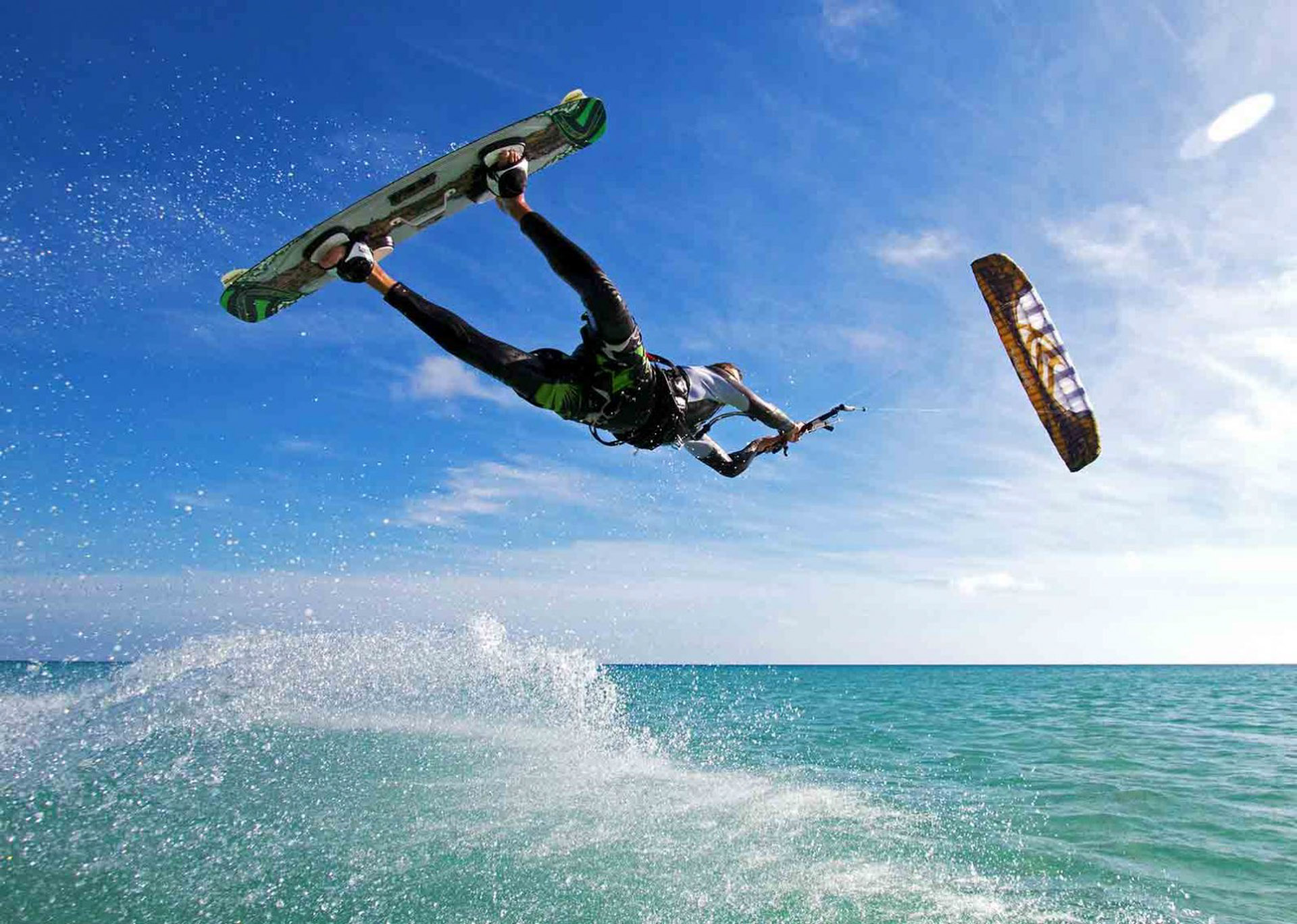
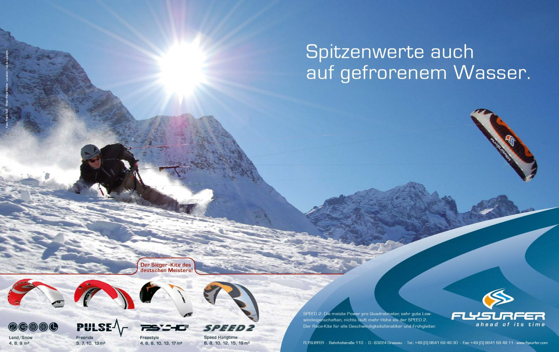
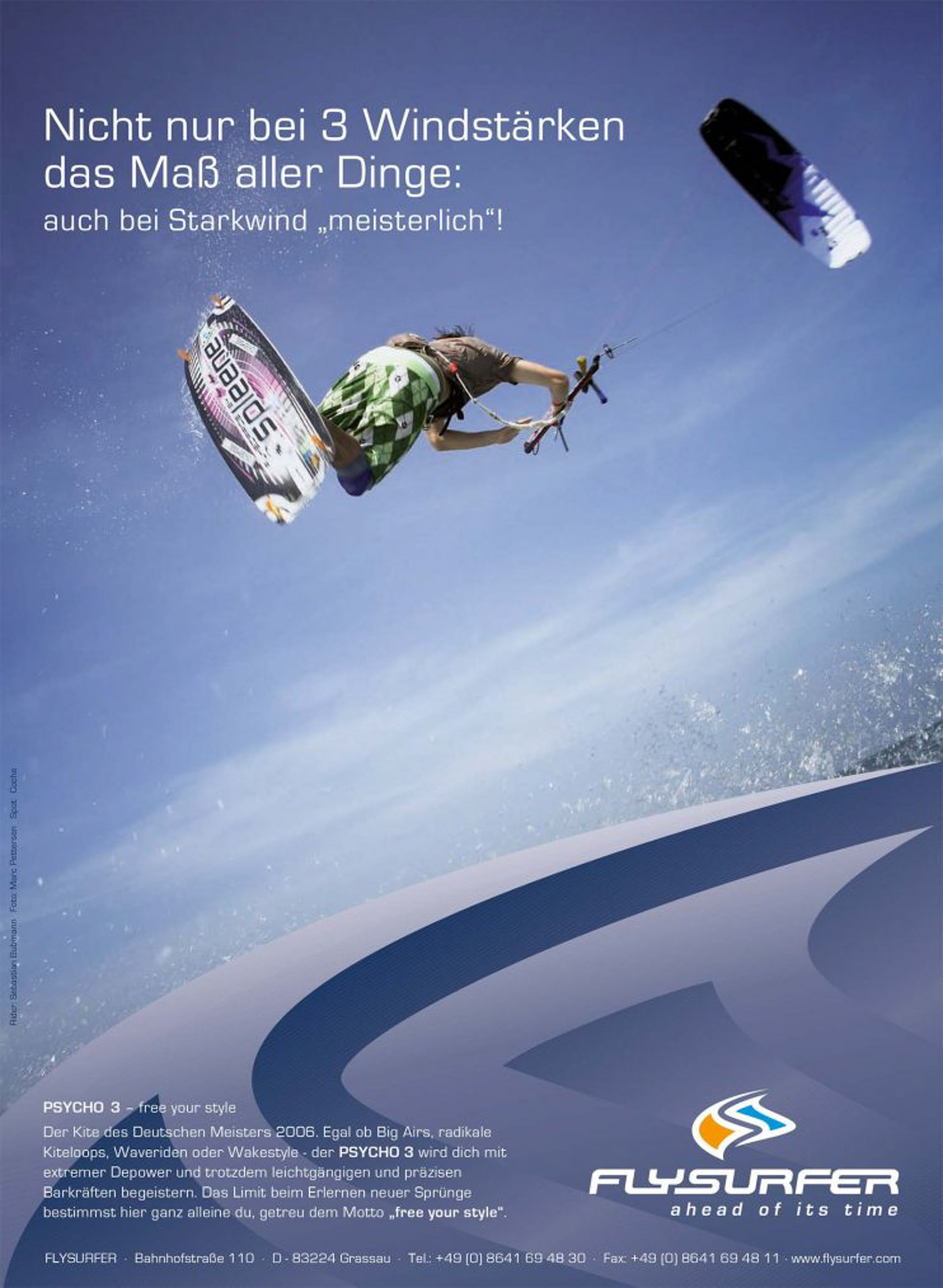
Rolf’s influence is still living up to his former hype and can be found in the hands of many kiteboarders. The iconic SPEED series proudly reflects his great work for the brand. Thank you!
Go and dive into his creative mind: Formgeber